Category: Comics
DIGITAL VS TRADITIONAL
A meditation on mediums used to create comics.
This is a difficult topic for me because I find there are strong merits for both methods. Traditional media is definitely a more direct channel for artistic expression and can have unseen emotional benefits. However digital can allow for more experimentation and achieve a faster more polished outcome. I have ultimately found that a mixture of both yields the best results.
In this post, I will explore these concepts further.
When I first began making comics as a child I would draw them in pencil on the back of old math tests my father would bring home. Usually, each page was a full scene and each subsequent event would unfold on the following page.
Over time I began to seek out texts and “How-to guides” on making comics. All with their own special lists of tools and techniques. Blue line pencils, Ames guides and Windsor Newton series 7 brushes were my indulgences.
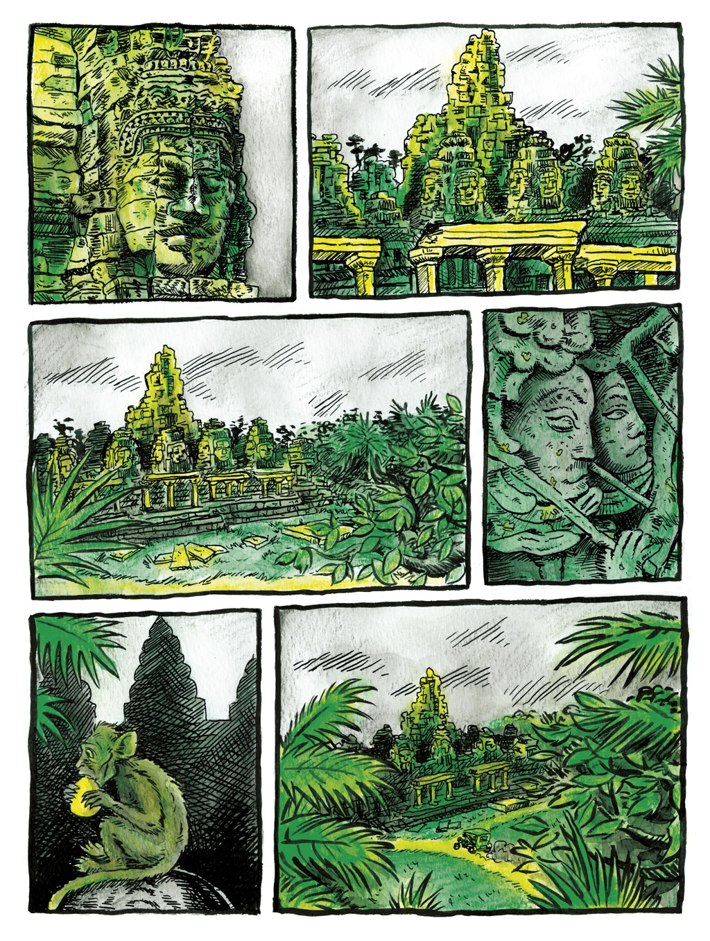
For several years I worked exclusively in India Ink and brush on bristol board. I have fond memories of quietly pulling the brush carefully along the pencil lines. One of my early works for Cloudscape was done completely traditional. Utilizing India ink, and coloured water-soluble ink pencils. Everything including the text was done by hand.
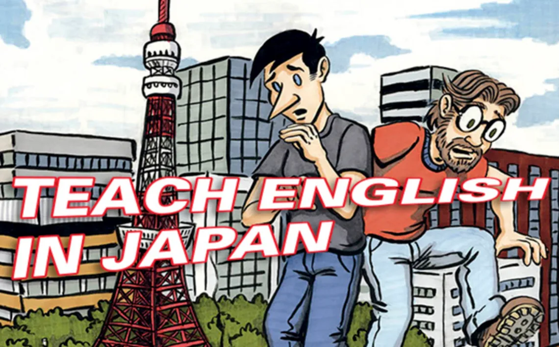
After this, my process became India ink art on Bristol board with computer-generated frames Photoshop gray tones and vector-based text balloons. That was how almost all of Teach English in Japan was drawn (My first webcomic).
Following this, I became more interested in drawing digitally. I quickly graduated to a Wacom tablet (drawing on a plastic pad separate from the screen) then graduating to a Cintiq (drawing directly on the screen).
I also discovered Clip studio paint (formerly Manga studio) and I used this program to create my current project Crossroads. The speed at which I can lay out a page and the ease with which a page can be changed has great appeal.
One interesting quirk is that I tried to do hand lettering in Clip studio for the word balloons in Crossroads. I had hoped to improve my lettering style (something I never felt I was very good at) but I found the tools were limiting my approach and the results were not good.

Ultimately I settled on developing a font based on my own handwriting using the Calligraphr website. This allowed me to use a digital font. Something I am more comfortable with, but still, give it a hand made feel.

For the most part, I am now working exclusively digital now. However, I’ve been considering doing another project like “A single step” in all natural media, for a change of pace. Currently, I have been doing quick journal comics in my sketchbook using a micron pen which i find have a nice spontaneous feel. However, I still dislike my handwriting so I often replace the text with my font before posting them publicly.

In the end, I think both have their merits. I find that natural media is still best for the initial idea inception, whereas digital offers fast ways to execute and greater flexibility to edit and refine after the fact, which can be a double-edged sword.

